Choosing the right colors for your e-commerce store
To showcase your brand to its full potential, you must have carefully planned out strategies and reviewed several marketing tactics. However, have you paid enough attention to the color scheme of your online brand?
The color scheme of a brand can play a vital role in elevating the brand’s value as it plays a major role in its visibility.
The objective of this article is to provide you with a brief overview of the tips for selecting colors along with their psychological impact on an individual.
Tips to select the right colors for an e-commerce store
For your e-commerce store to gain online recognition, you must give enough thought as to what color scheme you choose. Here are a few aspects to keep in mind while making your decision:
1. Consider the overall demographic
Understanding your audience is essential in order to be clear about the first impression you want to make on them. Which services and products do you offer and what emotions do you hope to evoke in customers?
As the most important factor to increase your e-commerce store’s visibility, color selection can make or break the value of your brand.
Selecting the right color isn’t easy. Be sure to think about gender and age groups in your research. The study by Joe Hallock finds that blue is the most preferred color by both men and women, while brown is the least preferred color.
In addition, color preferences change with age. If your goal is to market to a specific age group, then you should consider the color that stimulates their emotions and feelings. In Faber Birren’s book, he reveals that blue is the favorite color of all age groups. Nevertheless, these likes and dislikes differ geographically, and are in constant transition.
2. Decide how many colors to use
Choosing the right primary color is not the only challenge. Another challenge that comes up is how many colors to use and what should be the division of each of them.
Well, a rule commonly referred to as the 60-30-10 rule may be of help to resolve this dilemma. According to this rule, one should consider 60% of the dominant color, 30% of the secondary color, and 10 % of the accent color.
Consider the base colors that will assist in evoking the right emotions in your target audience. To choose a secondary color, you can conduct A/B testing. It should blend well with the primary color.
Finally, accent colors serve to grab attention and even though they have a minimal percentage, they are very important to prompt action. Such colors should stand out immediately against the other two. For example, the use of yellow as an accent color in conjunction with black and white.
3. Consider user experience
Customer experience is the top priority for any entrepreneur or digital marketer. Thus, when selecting color schemes for your page, you should consider what effect you wish to achieve.
Color schemes influence the overall branding of the company. If your store doesn’t meet visitors’ expectations, then that could be a great turn-off for your potential customers.
Using colors that are easy to read can improve the user experience. Similarly, use soft background colors, instead of colors that are just striking.
For your business to grow, you need a balance of colors that appeal to all types of visitors.
4. Apply color psychology
Colors have a direct impact on marketing and sales. Therefore, choosing the right colors for your brand’s identity is crucial for increasing conversion rates.
Emotions tend to influence the buying decision most of the time. Therefore, one should look for colors that go well together and compel the audience to purchase by making them feel welcome.
To prompt your visitors to take an action, your CTA buttons should be bright and noticeable. To push the audience down the sales funnel, you should pay attention to the psychological implications of each color, instead of personal preferences.
Blue is a color Walmart uses for its CTA, and Amazon prefers yellow. Yellow grabs the attention quickly, while blue evokes trust.
5. Consider the color wheel
The color wheel can ease your process when it comes to finding the right color scheme for your store. This will help you decide how colors complement one another.
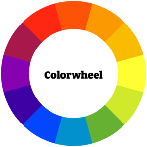
Figure 1: Colorwheel – A helpful tool for choosing the right colors
You can experiment with different color schemes to see which one works best. Following are a few schemes to look out for:
- Complementary: Using colors that are opposite each other.
- Analogous: Using colors adjacent to each other.
- Triad: The use of three colors equally spaced along a circle.
- Split-Complementary: Using two colors that are standing next to each other and a third, which stands opposite these two.
- Rectangle (tetradic): Use two pairs of colors that are opposite each other.
These simple yet very useful schemes are of huge help to make your e-commerce store look visually appealing.
6. Consider cour industries and products
About 80% of people identify their favorite brands by their color. As a marketer, you must take into account your niche and the competition. The colors used in the logo must appeal to your audience, and the schemes should accurately represent your brand.
For instance, if your business deals in recycled products, you can use a combination of blues and greens. In the same manner, black and gold are essential when selling luxury products.
The other way is to not rely on the norm but instead experiment with different approaches to stand out in your industry. To know how your potential audience will perceive the change, you’ll have to try and test different schemes.
Consider exploring and observing other stores to get a better understanding of the dos and don’ts of your e-commerce store scheme.
The Interpretation of colors
Empowering your customers with the right emotions helps you establish brand familiarity and trust. Here are five popular colors and the vibe they emit.
Red
The red color is associated with passion and love. It evokes extreme emotions. It helps to encourage appetite thus used by restaurants. It causes emotions like:
- Courage
- Energy
- Attention
Red is the primary color used by brands like Coca-Cola, Netflix, Toyota, and H&M.
Blue
The blue color represents calmness and serenity. It also creates a sense of trust in the brand. Mostly used by corporate businesses to improve the performance of individuals, it evokes emotions like:
- Responsibility
- Peace
- Productivity
Companies like Twitter, Dell, Pepsi, and LinkedIn utilize this cool color in their branding.
Green
Green is a very soothing color. Often associated with tranquility, money, health, and nature. It represents growth and harmony. It stimulates emotions like:
- Sustainability
- Reliability
- Security
Starbucks Coffee, Spotify, Tropicana, and Android logos are of green color.
Yellow
Yellow is instantly recognizable. This color stimulates mental activity. It gives the impression of hope and warmth. It’s a great choice to grab the attention of window shoppers. It elicits the emotions like:
- Motivation
- Positivity
- Happiness
Yellow is the color of choice for IKEA, Nikon, CAT, and McDonald’s.
Black
Black is the color associated with luxury and prestige. This color shows confidence and can be felt attractive. It is indeed a versatile color. It evokes the sense of:
- Timelessness
- Power
- Sophistication
Uber, Adidas, Gucci, and PRADA all choose classic black as their brand colors.
Conclusion
Your e-commerce store’s marketing and branding have a great deal to do with color schemes. It can have a far greater impact on your audience and sales than you might think.
Nevertheless, there isn’t a one-size-fits-all solution because not everyone perceives colors in the same way. Understanding the psychology behind each color helps you to build a stronger emotional bond with your target audience.
Unsure which color fit your brand best? Get in touch with us and let one of our experts help you make a decision.